Tuesday, 16 December 2014

Greeting cards assignment

Name : Joey Wong Li Wen
Principle of  Design
Assignment: Greeting cards

This was our last assignment for this subject.

Our task was to create a set of cards . The instruction given were : choose 3 themes and sketch out 3 ideas for each theme. The number of card we had to make was reduced from 3 to 2 .

I always have a great interest in Victorian era and anything Gothic, so these two were my chosen theme.

For Victorian era, the first idea that came to my mind was masquerade party. After this I also sketched out idea for Easter Egg hunt card and tea party invitation card. These three were common event that were held during the Victorian era.

For Gothic, my idea was cards for Halloween party, fashion party and birthday party. Although Gothic is my favourite style ever, I found problem trying to design cards for it as Gothic,the dark and scary elements are not suitable for most of the occasions.

During tutorial, Ms.Lisa approved my idea for masquerade party.


This idea was to make card with a transparent sheet as front page, with a masquerade mask on it, while the inside will be figure of a male and a female , dressed in Kodona and Lolita style of clothes respectively. Kodona and Lolita are fashion inspired by Victorian era that are now commonly seen in Japanese fashion scene. When the card is closed , It will appear as if they are wearing masks. Ms.Lisa also asked me to combine Gothic into the cards.
Final result;

As they are supposed to be shown as under the same theme and set, I designed similar clothes for them. The background of cards were also decorated in the exact same way.

I had a lot of fun making these cards as I love to draw human in this style of clothes. The challenge I faced was that I had to be careful so I do not overcrowd the card. It was certainly interesting .

"Simplicity is not bad." was the most important lesson I learned from this assignment and I would like to thank Ms.Lisa for this.

Colour Wheel Assignment

Name : Joey Wong  Li Wen
Principle of Design
Assignment: Colour Wheel


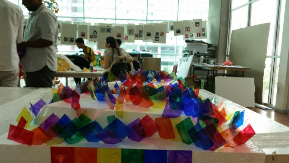
For this assignment, we were asked to choose a type of colour wheel, and create a 3D object that shows the colours. We were required to work in a group of 4. My group mates are Maariyah, Audrey Christopher, and Sangitha. Colour wheel of six colour was our decision.
In our first group discussion, our idea was to create a platform, with colour bulb installed on them. The picture below is a rough sketch of the idea stated.
However, we found that it was beyond our ability and budget limit to create a platform that is big enough to impress others.

So we had another discussion, and came to this idea.
This time we thought of creating a 10cm x 10cm x 10cm cube, with each colour of colour wheel on each side. However, again installing lights was a problem for us .

During the process, we discovered that instead of installing light bulbs, the reflection of colours on surfaces actually looked much better , so we decided to proceed with it.

Each of us group member got a few transparent sheets, divided the space into 2" x 2" square, and colour them with the chosen 6 colours. Then the squares were cut out and arranged onto a piece of styrofoam surface.

It may looked like a big mess, however, this is a organised chaos. Each and every line follows the colour orders of red, orange, yellow, green, blue and violet.

We were lucky that the sunlight was strong during presentation, as this colour piece will only look good under sunlight.

This assignment has certainly help me in learning to work in a group. As a group leader, I had to make decision very quickly after discovering problems that would halt our progress. There were certainly frustration among group members as one of the members had transportation problem, and was often late or absent during group meeting. I had to make sure that she did the same amount of works as the others did so that it would be fair to them. Fortunately, everything works out at the end.

Monday, 10 November 2014

The Rule of Thirds Photo Video

Date: 11/11/2014
Name : Joey Wong Li Wen 
Principle of Design 
Assignment: the Rule of Thirds Photo Video


During lecture, we were taught about use of the rule of thirds in photography and the discomfort tangent.

The rule of thirds is basically about imagine the image is divided into 9 equal parts, and try to use the 4 intersecting points of the imaginary lines as the guide to take the photo.

We were asked to take some take test shoot and proceed in making video after getting Ms.Lisa's approval.

She approved this set:
so, I proceeded in making video.

After several consideration, I decided to make a video of them baking.

Video:

Some of the problem I faced during making this video : These figurine cannot stand on their own, they fell into the ingredient a few times.... Besides, to find a suitable angle for the photo was quite a challenge for me.

This assignment has certainly help me in understanding more in photo taking.

Tuesday, 30 September 2014

Assignment 2A)Composition of Principles of Design

Date:30/9/14
Name: Joey Wong Li Wen
Principle of Design
Assignment 2A)Composition of Principles of Design


  In this assignment, we were required to read through the slides that Ms.Lisa gave us and understand the six principles of design.

   The six principles of design are: balance, contrast ,dominance, proportion and scale, rhythm and repetition, and unity and variety.

   These are my final work:

Balance:
For balance, we were allowed to choose from symmetrical balance, asymmetrical balance or radial balance, I had chosen radial balance .

Contrast:
I had chosen the option of large vs small for this principle. For some reason, I had the series "Alice in Wonderland" in my mind when I did this work, so I drew a boy and a small rabbit.

Dominance:
For dominance, there must one element that stands out among a group of same element. I filled the paper with green roses, and drew one pink rose,and it is the only one that was slightly coloured.

Proportion and scale:
for this, I divided the paper into half , and continued until the space is too small to be divided. I think this is the easiest way to show proportion and scale as all the rectangle are proportioned.

Rhythm and repetition:
Among regular repetition, flowing,and progressive, I chose regular repetition. This work was also inspired by "Alice in Wonderland", I designed a picture of a rabbit wearing bow tie, and repeated this design all over the paper.

Unity and Variety:
In unity and and variety, these is always a variation of things that are united by one element, it could be colour, lines or size and shape. I have always like fashion design, so I designed 4 sets of clothings, and united these clothings by colouring them using the same colour palette.


   After finishing this assignment, I realised that understanding the principles is sure easy, however, applying them in design is sure not easy.The actual time I spent on coming out idea of my own art style that uses these principle is longer than the time I spent on doing these drawings, but this assignments is certainly helpful and I will remember to apply them in my future works.

Tuesday, 9 September 2014

Principle of Design Assignment 1b self-portrait

Date: 9/9/2014
Name: Joey Wong Li Wen
Principle of Design
Assignment 1b) Self-Portrait.


For this assignment, we were instructed to research on art movement, select one , and create an A3 sized self-portrait using the art movement.

   I have always like Gothic art, so I researched on the history of Gothic art.

  Gothic art is a style of Medieval art that developed in Northern France out of Romanesque art in 12th century AD. It started with Gothic architecture, which was popular in the Northern Europe, in mid-12th century. Slowly, it developed and spread into International Gothic, where it was used in painting, sculpture and decorative art, between 1375 and 1425. In some places, gothic art died out for a while. In mid-18th century, Gothic art was revived, this era is called the Gothic Revival. In 1980s, Gothic art developed into Neo Gothic art, as a part of punk movement. In late 1990s, it becomes recognized as a new artistic style. The term "Neo-Gothic Art" was coined by Charles Alexander Moffat, who wrote "The Neo-Gothic Art Manifesto". This art movement emphasizes the bizarre, obscene, sexual, blasphemous, mysterious, horrific and gender-confusion.

   My favourite Gothic artist is Stefanie Lynn Evans. Her artworks are dark, surreal ,and even twisted. These are some of her works.

 Lady Night: 2002

 Pray For Salvation: 2000

" My work is generally dark in nature and is presented as a reflection of myself, how I feel about others, and my perception of the world around me."Stefanie Lynn Evans.


   I decided to choose Neo Gothic art as the art movement fr my self-portrait. In Gothic self-portrait, the human would always have pale complexion,  sharp cheekbones, dark make-up and is always dressed in Gothic fashion.
Self-portrait progress:


My thought:
When I was doing research on Gothic art, I was surprised that although Gothic art movement has exist for a long time, there are only four main eras of it, which is much lesser compared to other art movements. Which amazes me more is that it never ceases its own classical style after centuries. Gothic was heavily criticized and described as “monstrous” before it was accepted as a style of art.
For the self-portrait, I tried to express myself by drawing both sides of me. Ever since I was young, I wish to be a boy. Until now, sometimes I put on make-up and style my hair to show my boyish side, and no one could recognize me since I will look totally different from my usual self. Thus, drawing a boy version and a girl version of me was a choice of doing the self-portrait.

Final portrait:


Video:


reference link:
http://www.arthistoryarchive.com/arthistory/gothic/arthistory_gothicart.html
http://www.lilithgallery.com/gallery/stefanielynn_evans.html


Principle of Design Assignment 1a mind map and self-portrait

date: 9/9/2014
Name: Joey Wong Li Wen
Principle of Design
assignment 1a) Mind map and self-portrait


It was our first class of Principle of Design. After a short a short brief, Ms.Lisa instructed us to create a mind map to introduce ourself and a self-portrait using trash we could find around the campus.

Mind map:


Whenever I am asked to introduce myself , I would list down the things I like. I always have colourful hair. I like black and purple colour, and also anything Gothic. My hobby is sewing, I sew whenever I am free. "How to Train Your Dragon is my favourite movie. Lastly, I am a big fan of Japanese culture. Japanese music, Japanese food and Japanese Fashion are always my favourite and are always an inspiration for me.

Self-Portrait:
 I used the back of an used paper to cut out the face. I tried to find red paper, since my hair was dyed red, however, pink was the closest colour I could find. All other parts were drawn on.